
- Date: 05.2016
- Platform: Web
- My Role: Interaction Design, Visual Design
Overview
Create a graph to give facility managers a visual way to see projected growth of employees in multiple buildings, multiple cities and plan for over capacity.
Objective
View projected data to see when number of employee equals the number of available seats.
Tools
Invision Freehand for wireframes, Adobe XD for Visual Design
Steps
Requirement Gathering, User Interviews, Multiple wireframe mockups for discussion. Created high quality design with specs for engineering and supported them with implementation.
UX Process
- The whole project took 6 months.
- Starting with Requirement discussion with Product manager.
- User interviews to understand the requirement and future needs.
- Then I created multiple wireframes so as to facilitate discussions with all the stake holders including Product managers, Engineering leads and QA lead.
- Once we narrowed down the final design, created three wireframes for three different levels of complexity for three different phase of development.
- Created final pixel perfect design with specs for engineering.
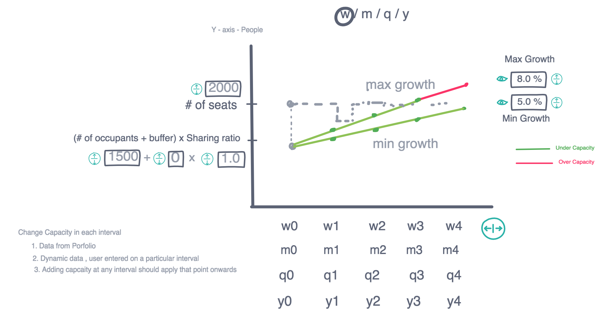
Once I had a good knowledge about the User requirement I created a wireframe to flush out all the functionality. The main idea was to show the growth and the seat capacity, and the point in future where the growth goes beyond the seat capacity when the facility manager will have to plan for more space. I created three mockups, one with simple line chart, another with tree map and third one with a complex bar chart. User should be able to select a value for growth range, both lower and upper and see the projection for the week, month, quarter and year. Link to the wireframes.
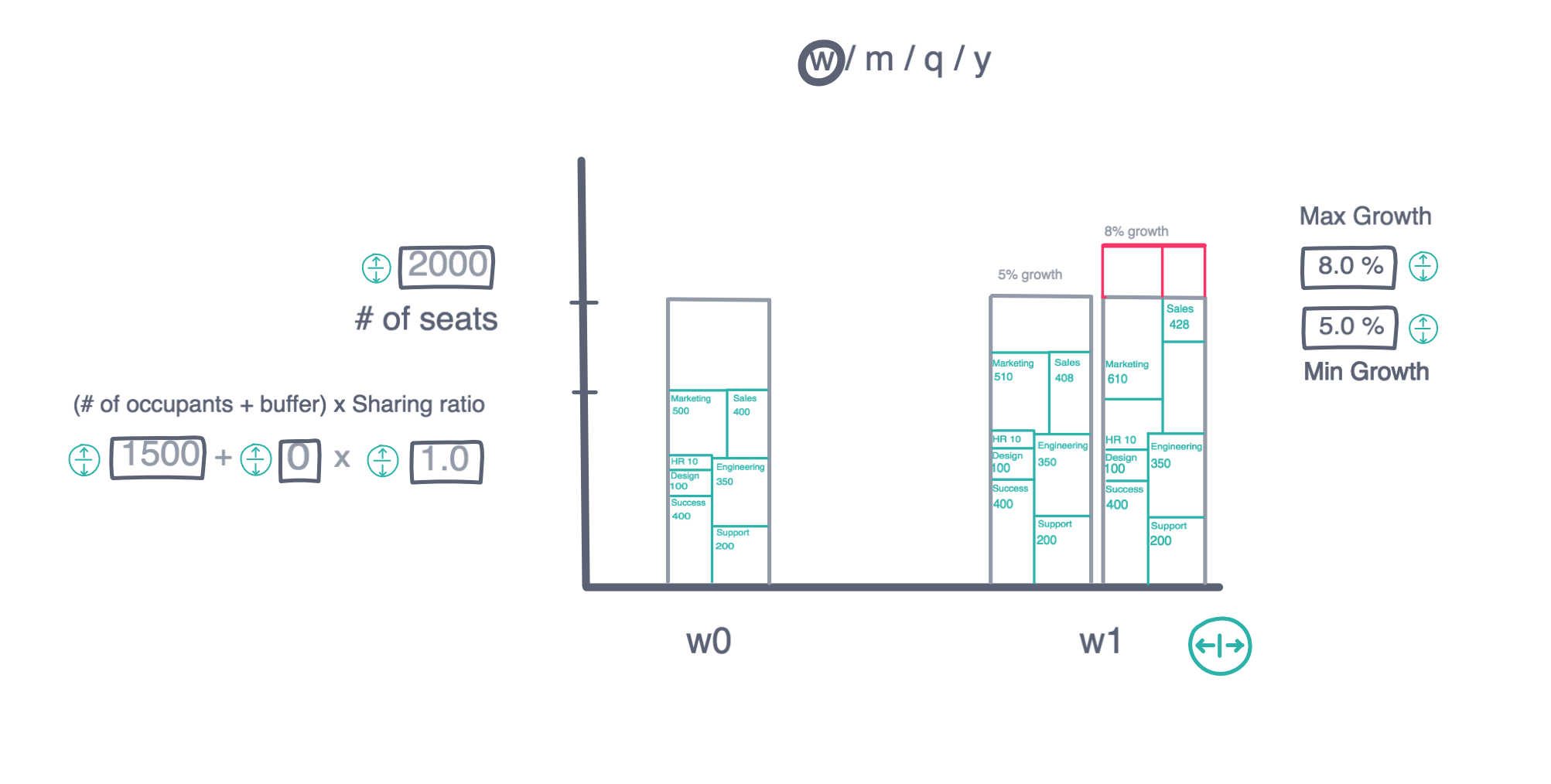
The second idea was to show more information in the building, in terms of floors and departments, A Tree map was great fit for this use case. Created a wireframe with some sample data.
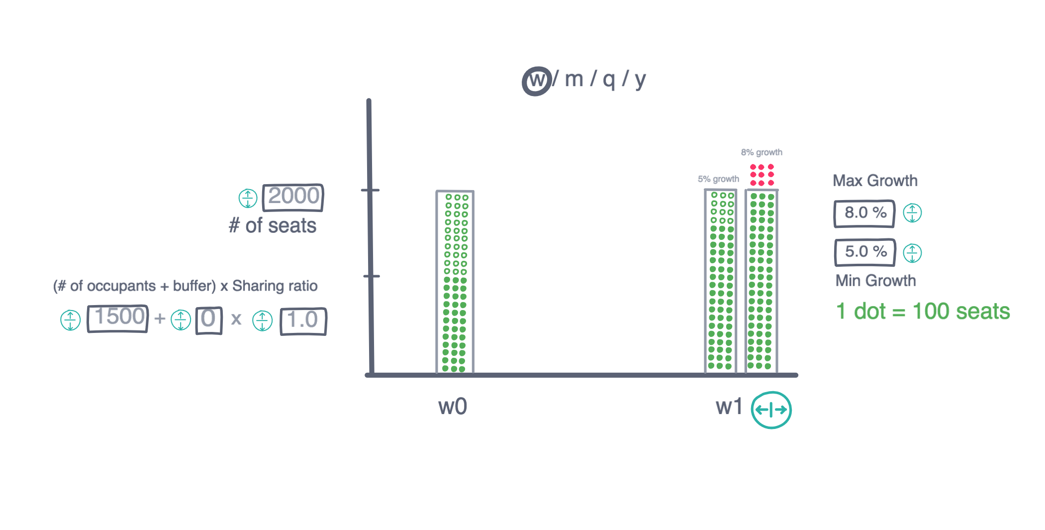
The last idea was to show number of people in each building because the graph was for occupancy, a dot can represent 100 seats.
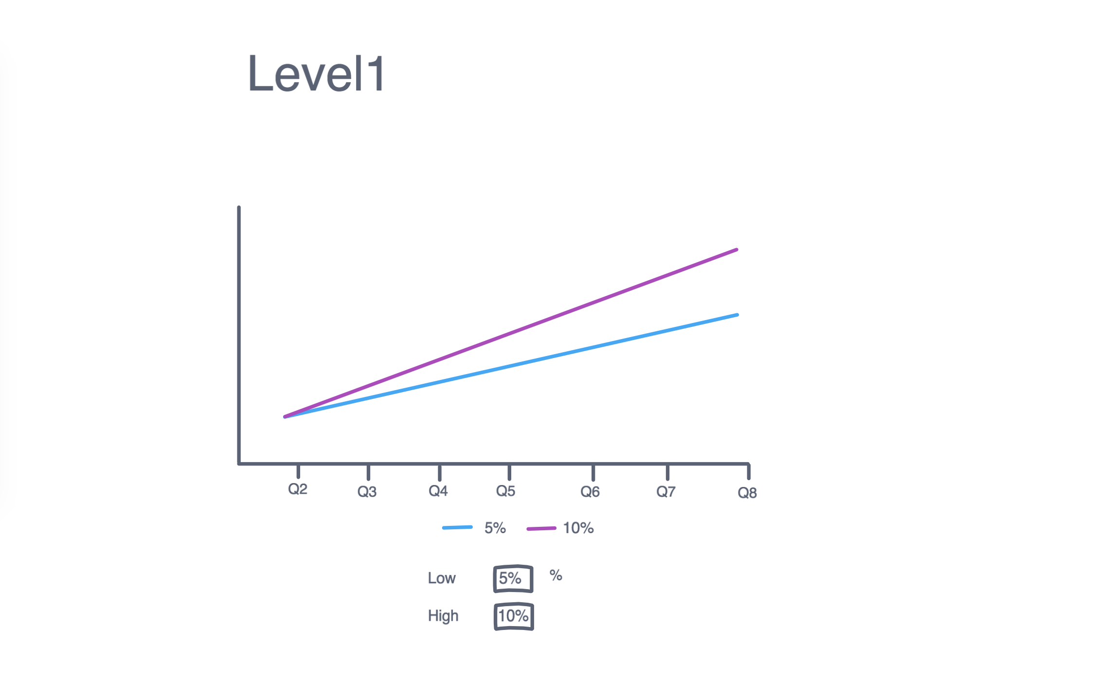
After the discussion with Product team and Engineering, I narrowed down to the first design. The simplicity of it was the winner. I created three wireframes for the Line graph for simple projection, range projection and projection per department. We also divided the project into three phases. Phase 1: Simple line chart projection with low and high range of growth plotted with the seat capacity.
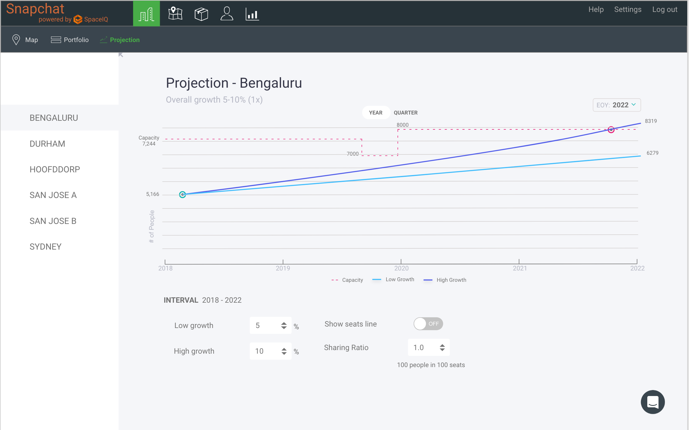
Then I created a high fidelity design for Phase 1. Here is link to the design.
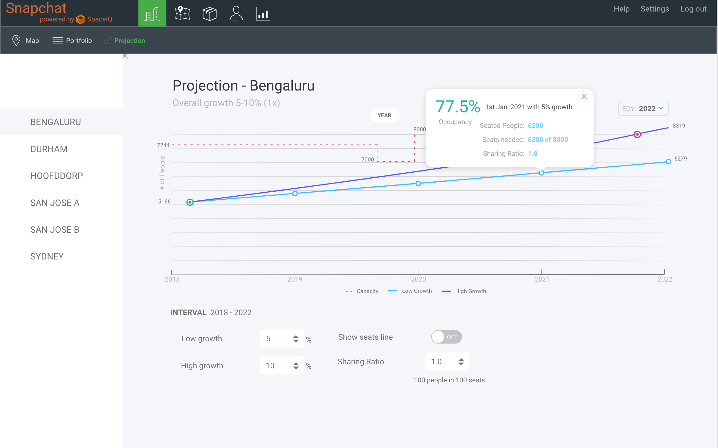
I used here the standard design pattern for popup for more information.
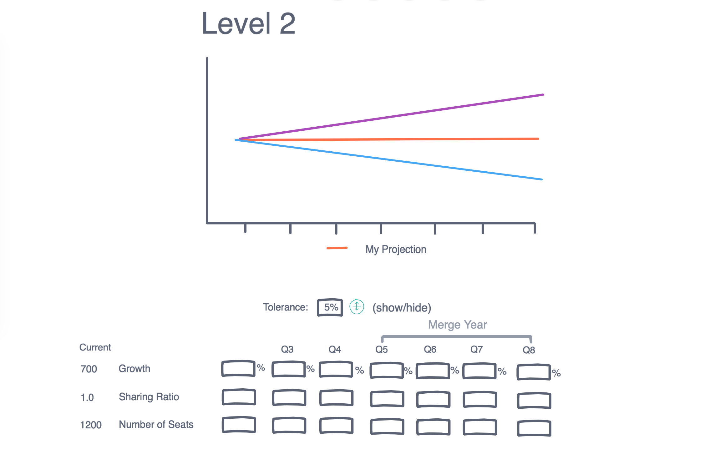
The second phase was custom growth where user can enter a tolerance (+/- 10%) along with "My growth" projection percentage. User had the option to enter projected data for each interval.
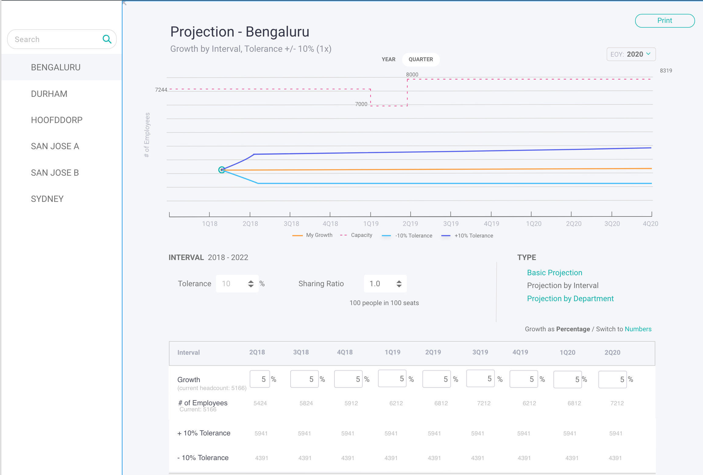
The Visual design needed many iterations with the engineering team and product team to make it to the final version. The unique feture here was user can enter growth by the interval.
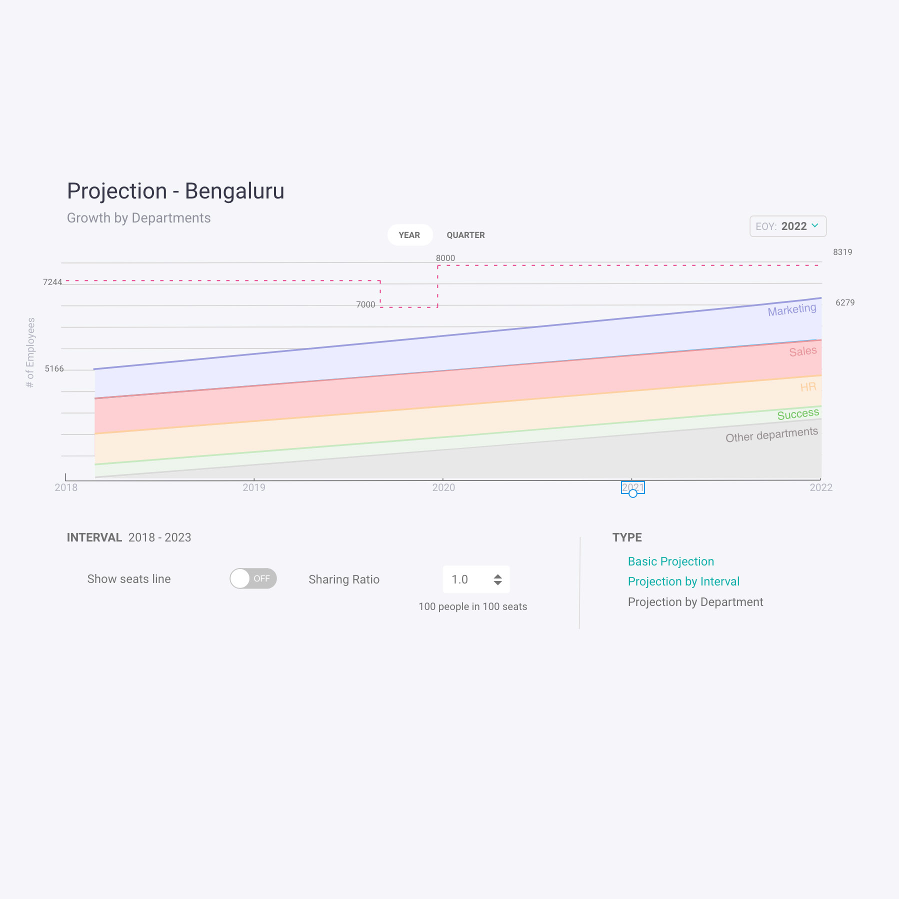
The Third phase was the most complicated of all because of the need for data visualization for multiple departments at the same time. In wireframes I used multi-line chart but it evolved in the Visual Design phase.
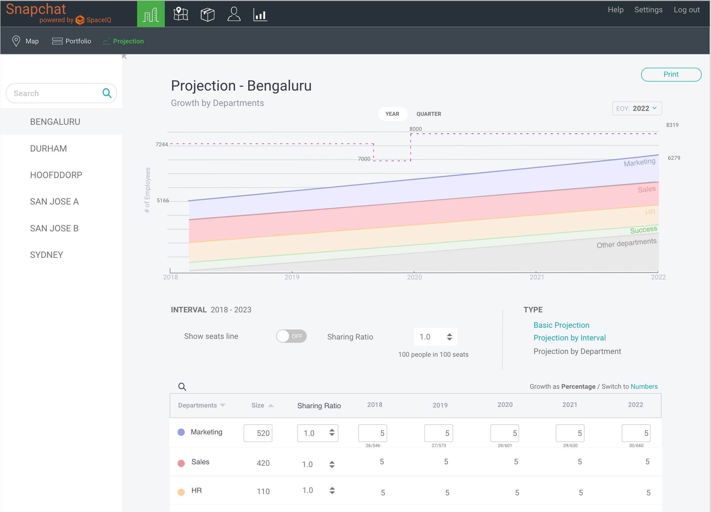
For the Visual Design I thought having 20-50 lines for each department would be confusing to understand. So I used an Area Chart to show relative growth between departments and showed only the top three and let user decide which department growth they want to see. I was pretty happy with the final design.
Conclusion
The whole project took 3-6 months and was completed in three different phases.
Link to the wireframes and design.
At each phase implementation we talked to customers to get their feedback and iterate over that. The line graph and the area chart was a big success, the implementation was seemless and the customers loved it. The projection feature became a premium feature of the SpaceIQ offering. One thing which every loved the most was ability to quickly change city on the left navigation.