
- Date: 03.2016
- Platform: Web
- My Role: Interaction Design, Visual Design
Overview
How do you give a facility manager the insights into the cost per building and compare for multiple buildings in multiple cities. I explored Bubble chart and Proportion area chart along with the traditional Bar/Multi-bar chart to show comparision visually.
Objective
Allow facility managers to compare cost for multiple buildings.
Tools
Invision Freehand for wireframes, Adobe XD for Visual Design
Steps
Created multiple wireframe mockups for discussion. Created high quality design with specs for implementation.
UX Process
-
The whole project took 2 months.
- Starting with Requirement discussion with the Product manager.
- User Interviews on how facility managers are using the Cost metric for comparision in Excel sheets.
- Created multiple wireframes
- Multiple discussions with the stake holders including Product managers, Engineering leads and QA lead.
- Once we narrowed down the final design for the phase one, created final pixel perfect design for engineering with specs.
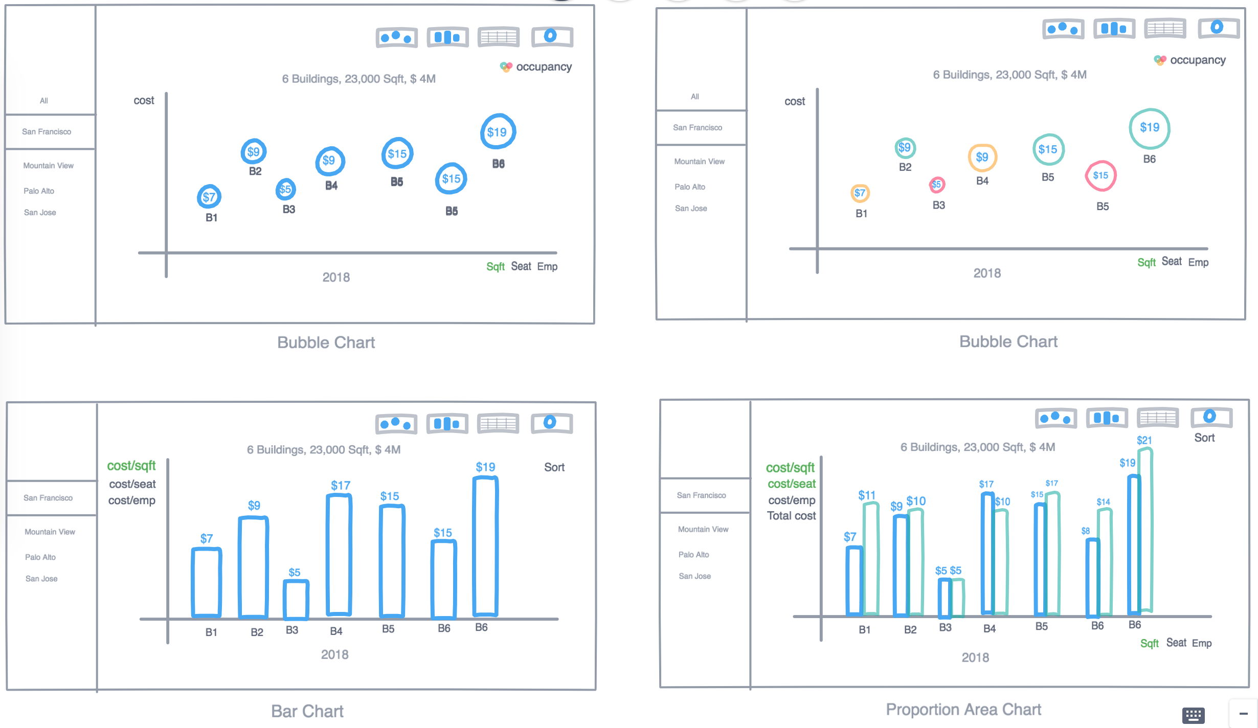
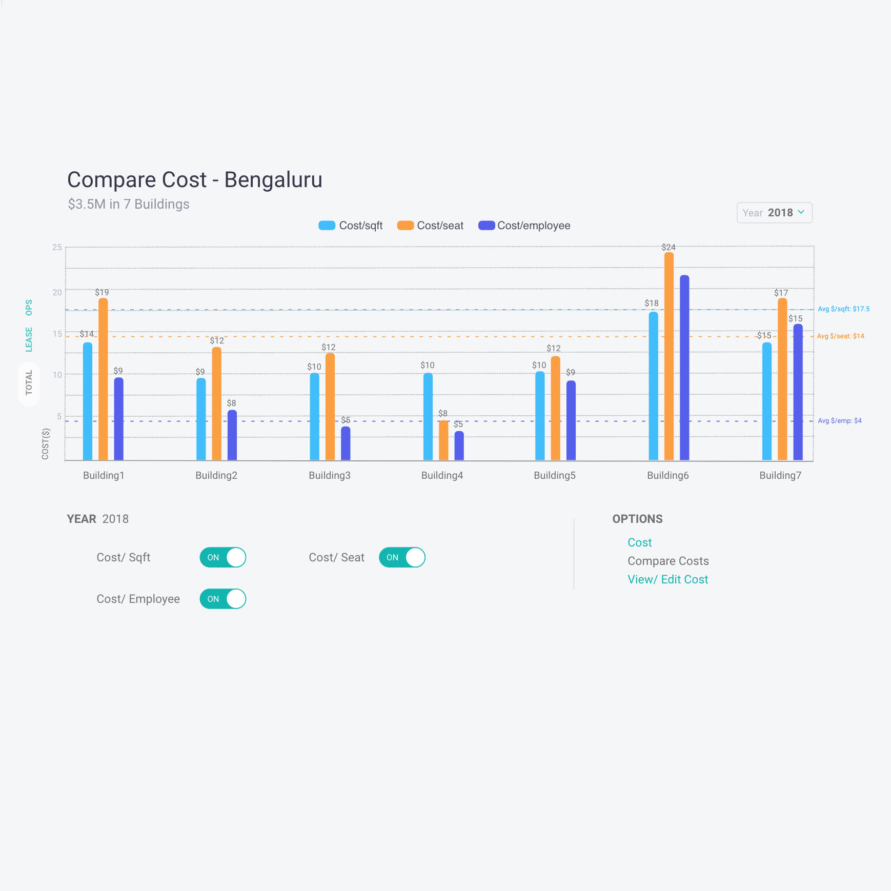
After the User Interviews and requirement discussion with teh Product manager, I created a set of wireframes to flush the idea onto paper. I used Invision Free drawing tool to quickly iterate multiple graphs. There were multiple dimensions of data. For plotting Building and Cost, I used a bar chart. For multiple types of cost Multi-bar chart was ideal for comparision. But for plotting 4 dimensions I used bubble chart. Where Cost and Sqft can be two axis and the third dimension was Cost/Sqft shown by the diameter of the circle. Another parameter was occupancy, so I came up with showing color as the fourth dimension in the bubble chart. With green where occupancy is 80% or less, yellow for warning 80-9% and above 90% color red for alert.
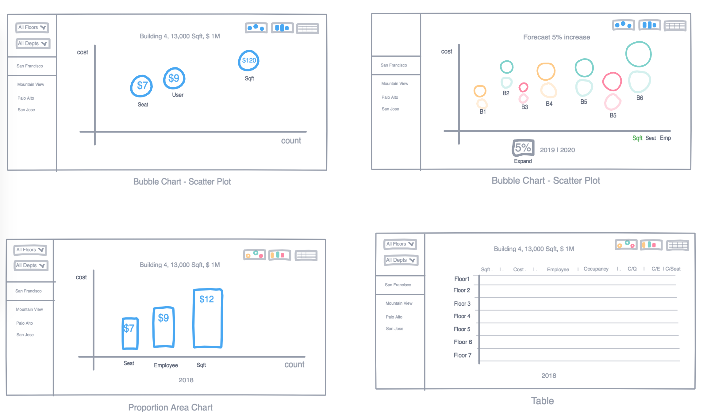
I also thought of future projections of the data with bubble chart and tabular view to summarize the data.
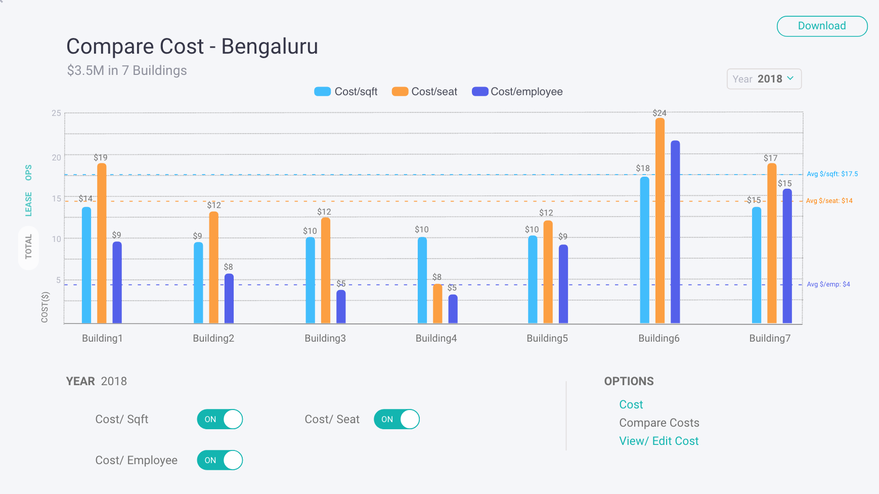
Once we flushed out the idea after discussing with all engineering adn stake holders i created hi-fidelity designs with data to showcase the final design and interaction.
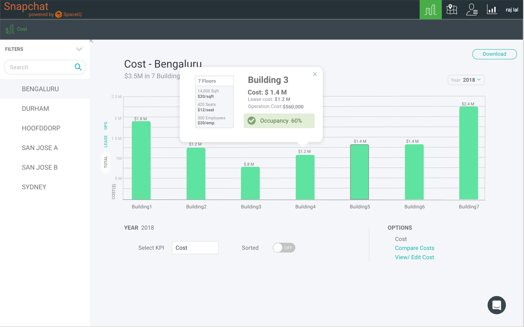
There was a need for a popup to show more information in the chart. I used the standard design pattern I had created, for popup design.
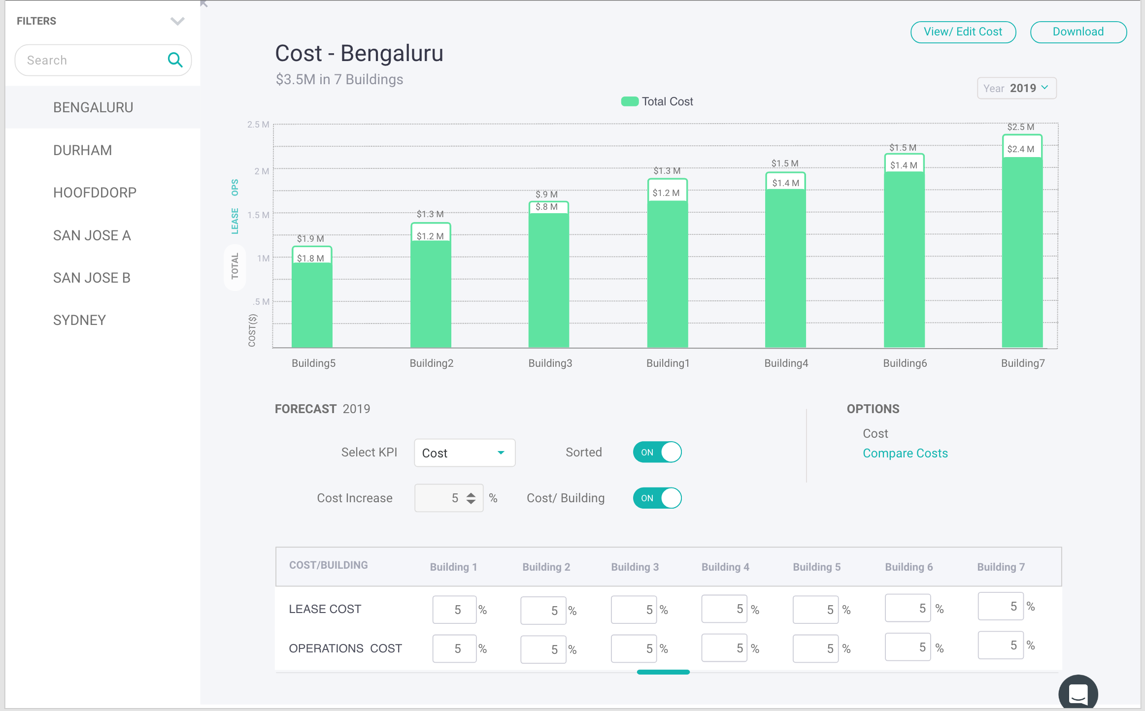
To show forecast for different years and see the data with variable cost i created an editable table below the graph to see the projected cost.
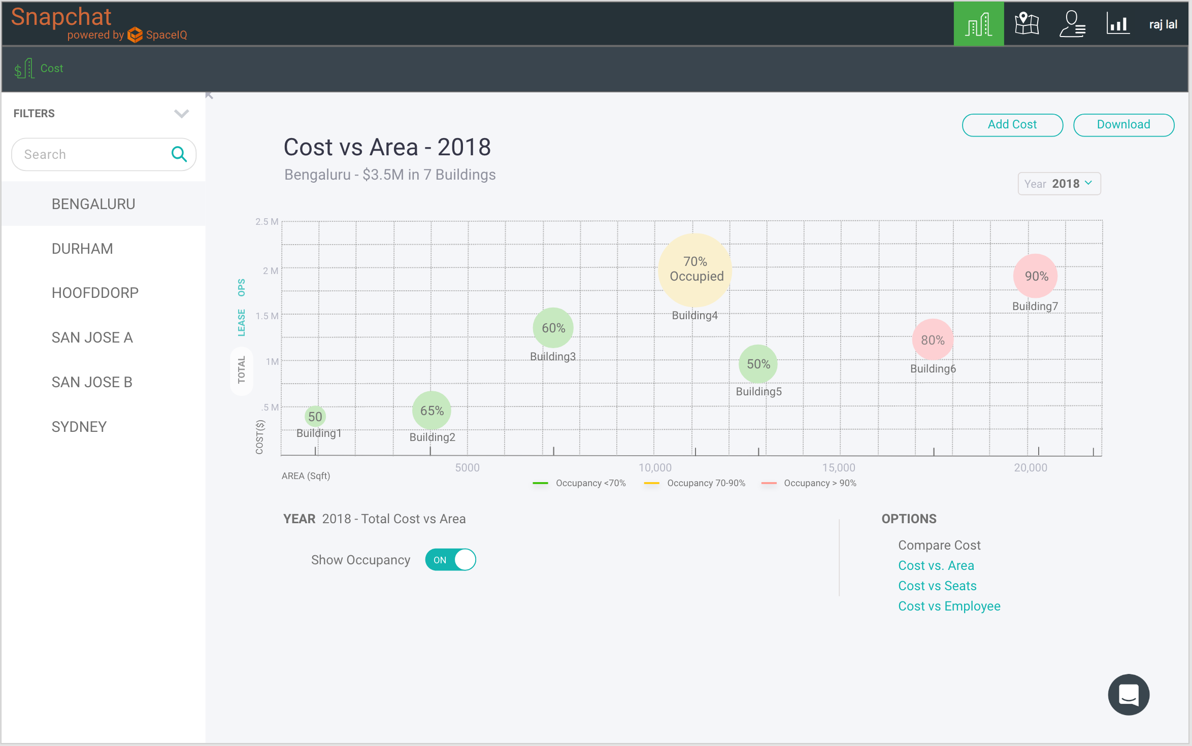
Bar charts are great for one dimensional data. For insights you need multiple data points plotted together. For this Bubble chart was the ideal candidate. There were four main parameters. Cost, Sqft, Ciost/Sqft and occupancy. I used Cost and Sqft as two axis and the third dimension was Cost/Sqft shown by the diameter of the circle. For Occupancy I came up with showing color as the fourth dimension in the bubble chart. With green where occupancy is 80% or less, yellow for warning 80-9% and above 90% color red for alert.
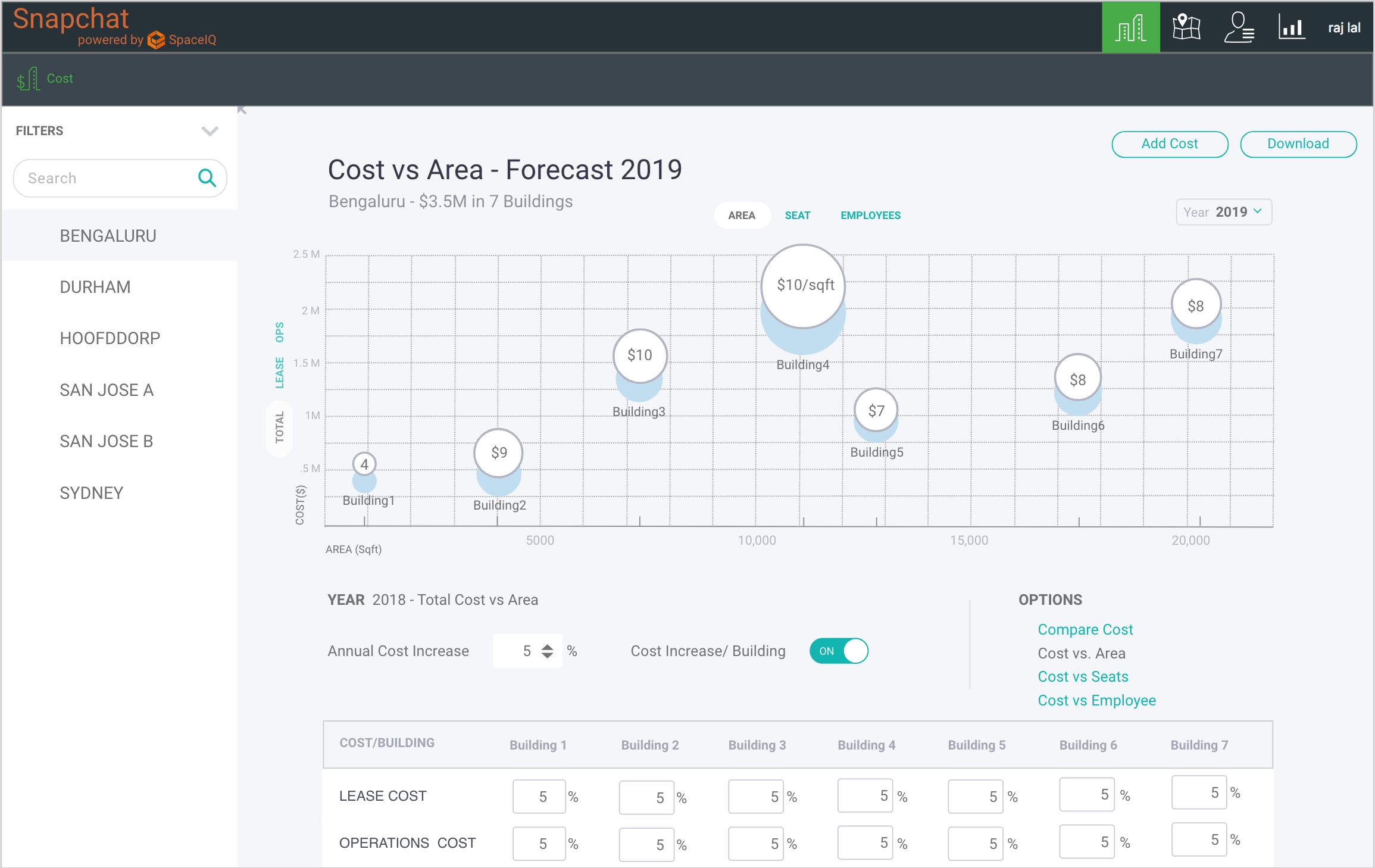
Created forecast with bubble-chart.
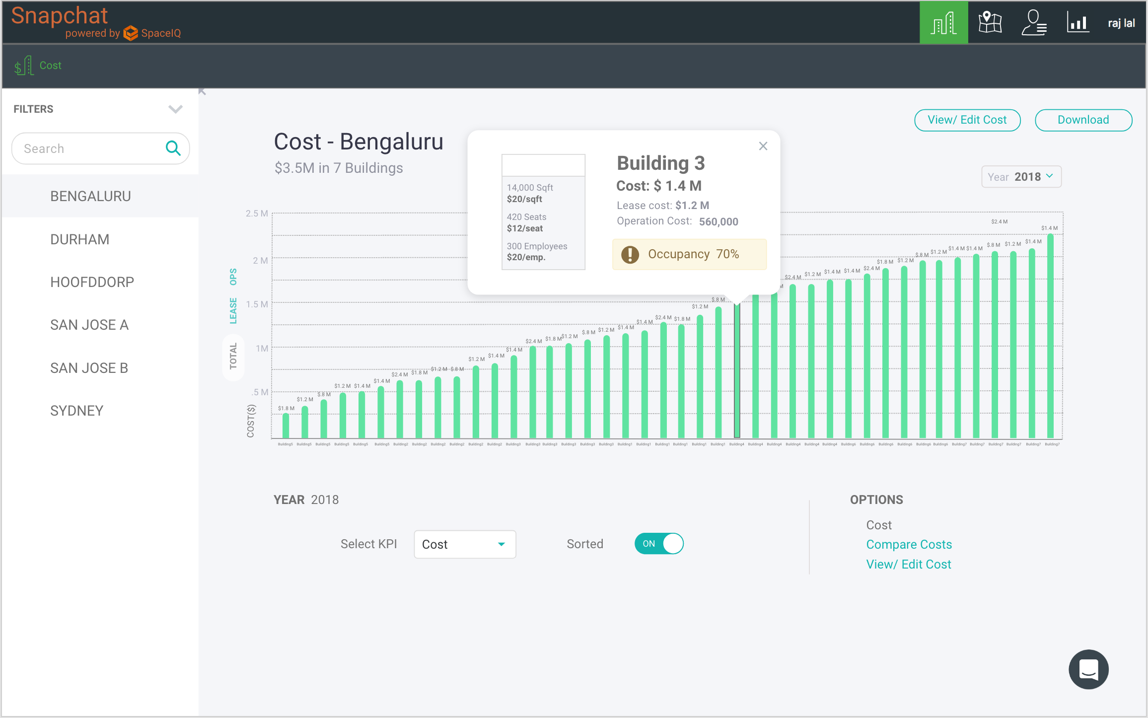
Scaling the graph is always a challenge considering we are talking about comparing multiple buildings from multiple cities, so I created multiple scenarios of design for up 84 buildings.
Conclusion
The Bar chart design was implemented in the first phase of cost comparison. After that we showed the design to Customers they loved the Bubble chart design which got slated for the phase two.